TONIDIGRIGIO PROFESSIONALS IN COMMUNICATION
BRAND IDENTITY E PACKAGING
A food product’s packaging is the first impression the audience gets of a company. If the packaging reflects the company’s values in visual and materials, it becomes the first communication instrument able to catch the attention and to create loyalty. It also foster a pleasant satisfactory sensation everytime the product is seen displayed on the shelf, or when it is tasted.
RINCI
Rinci is a young, dynamic local business which, thanks to a strong know-how, reinterprets traditional flavors from a contemporary point of view. Its products are genuine and include organic fruit compotes, sauces and local specialities like Spaccasassi.
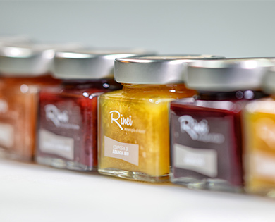
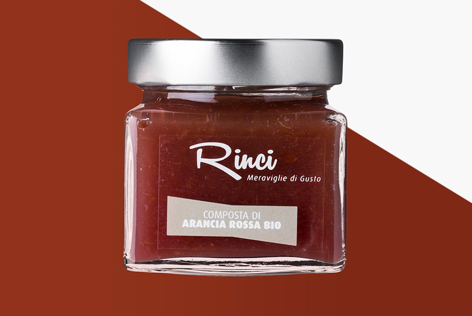
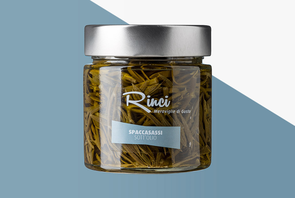
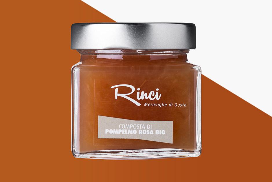
The content of each jar is the actual protagonist of the communication thanks to the transparent PVC label and the transparent glass jar. The products’ textures are chromatically completed by the choice of colors made for the communication style of the three product lines. The resulting palette is: aquamarine for “Sott’olio”, lilac for “Salse” and kaki for “Composte”.
Minimal graphic design, essential font and chromatic elements that guide the consumer’s eyes towards the content of the jars, highlighting the freshness and quality of the products.
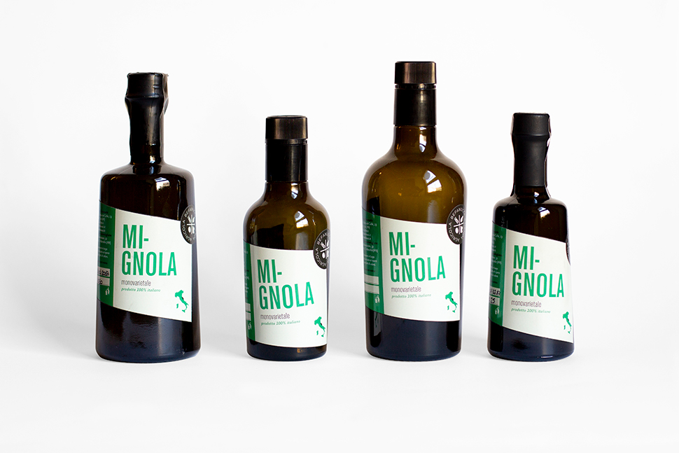
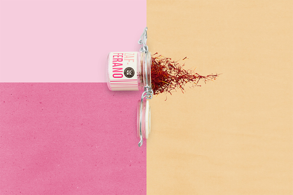
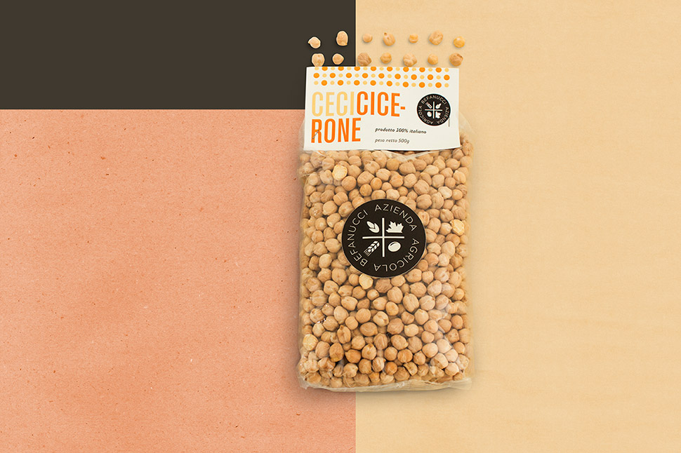
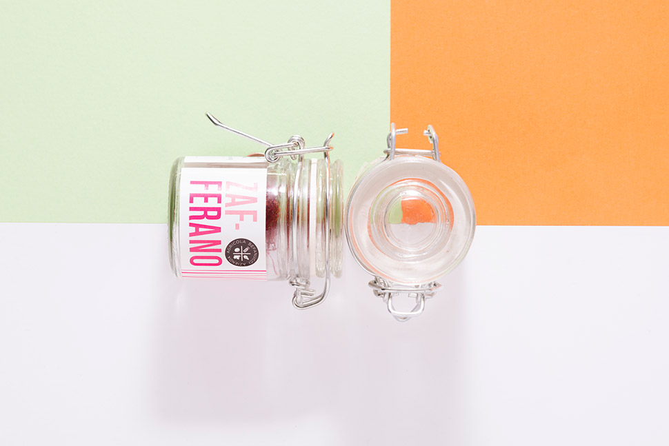
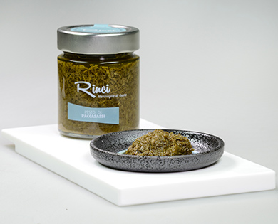
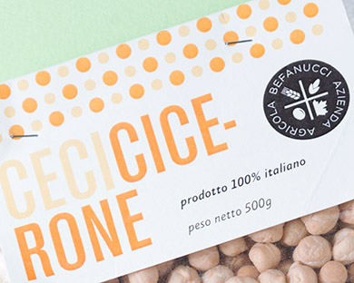
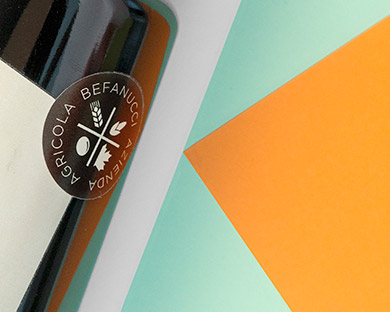
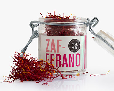
AZIENDA AGRICOLA BEFANUCCI
Befanucci has been an agricultural holding located on the hills around Jesi for many generations. From 2011, it has been managed by Stefano who, after attending agricultural science school and gaining the necessary work experience, decided to give new life to the farm, which at that point was simply producing cereals, and started to sell some of its agricultural products.
The packaging displays a sigil, in so that the product is easily recognizable, together with some highly characterizing graphic and formal elements. The labels change chromatically in accordance with the product. Colors are vibrant and dialogue with the typography style.

RIPABIANCA HONEY PRODUCERS
This beekeeping company now counts 100 hives in the Vallesina territory. The most important one is located close to a WWF protected area where, with the support of Don Antonio Miozzi’s Exodus Foundation, has been created a didactic farm with the goal of raising awareness on the importance of bees for our ecosystem.
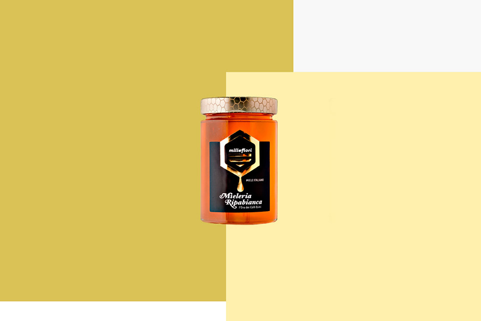
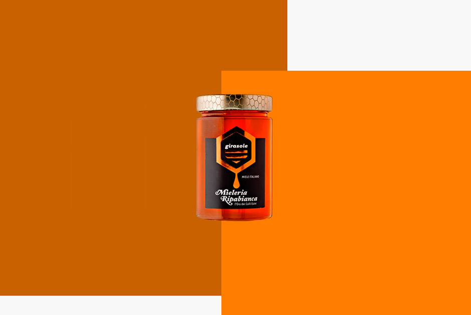
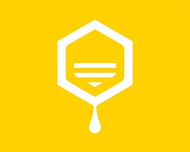
The creation of logo and identity for the honey vessels took its inspiration from one of the essential element of the beekeeping industry: the honeycomb, the set of hexagonal cells created by the bees. This relation between content and container becomes the metaphor of the act of making and consuming, a symbol that recalls the precious honey, harvested in the beauty of its natural forms.
The label features a different kind of lamination for each type of honey, which embellishes the packaging highlighting the different colors and the different contents of the jars.
RELATED PROJECTS

