TONIDIGRIGIO PROFESSIONALS IN COMMUNICATION
PROJECTS →
ZONA CONCE - IDENTITARY PROJECT
IDENTITY SYSTEM
CARIFAC ARTE
FABRIANO (AN)
2021
SELECTED AND PUBBLISHED ON:
ADI DESIGN INDEX 2022
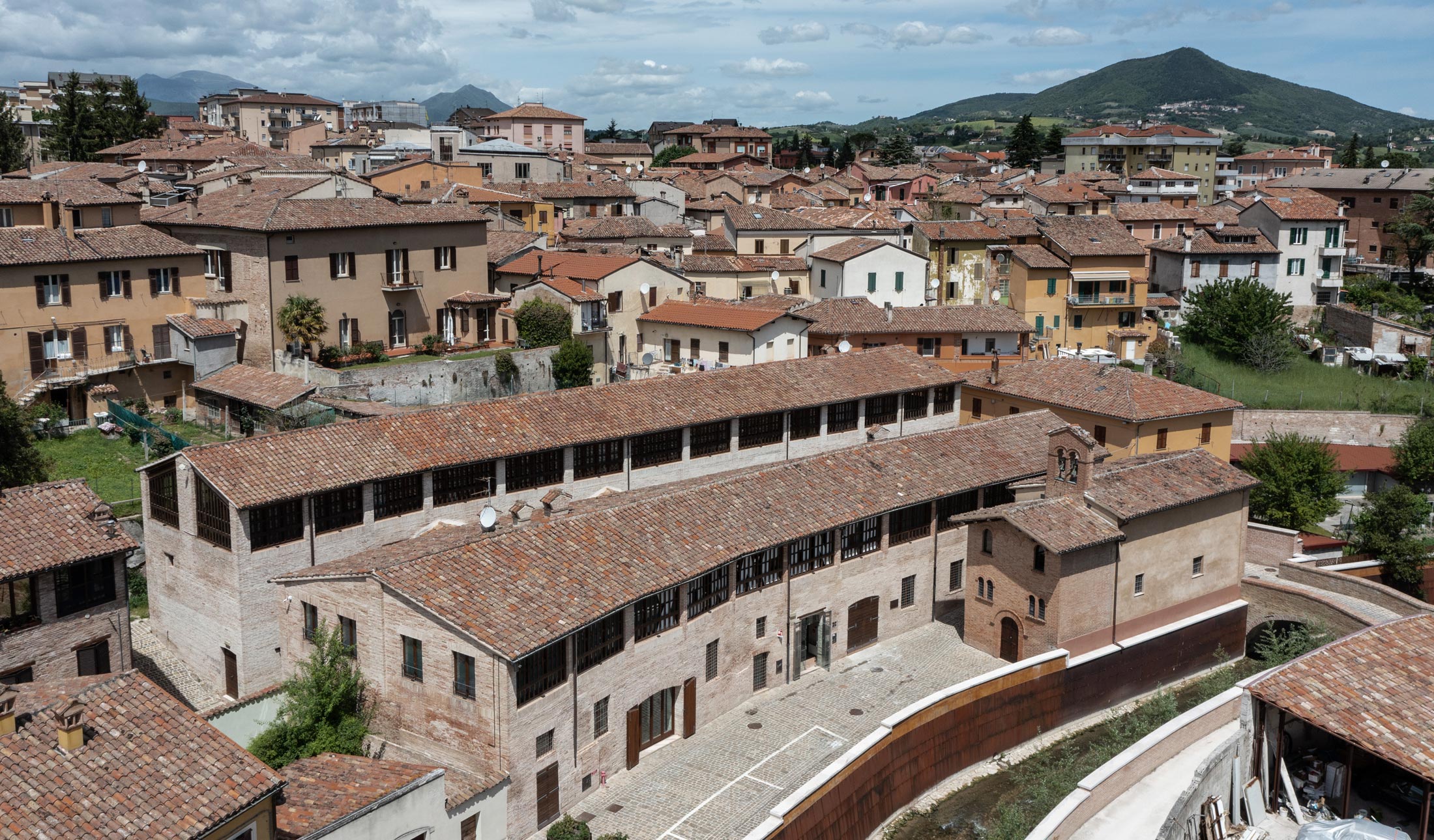
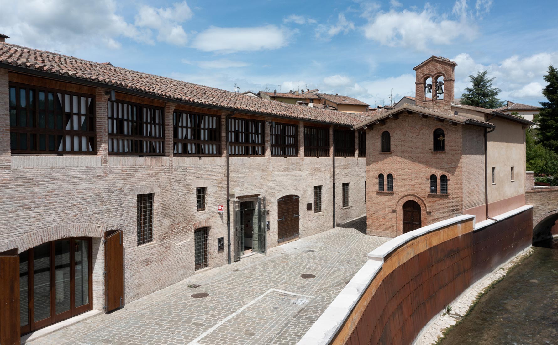
Zona Conce of Fabriano is a cultural hub, a meeting and sharing place animated by the great themes of culture, art and craft related to paper. The renovation project of the building complex was carried out by Fondazione Cassa di Risparmio of Fabriano and Cupramontana is now completed.
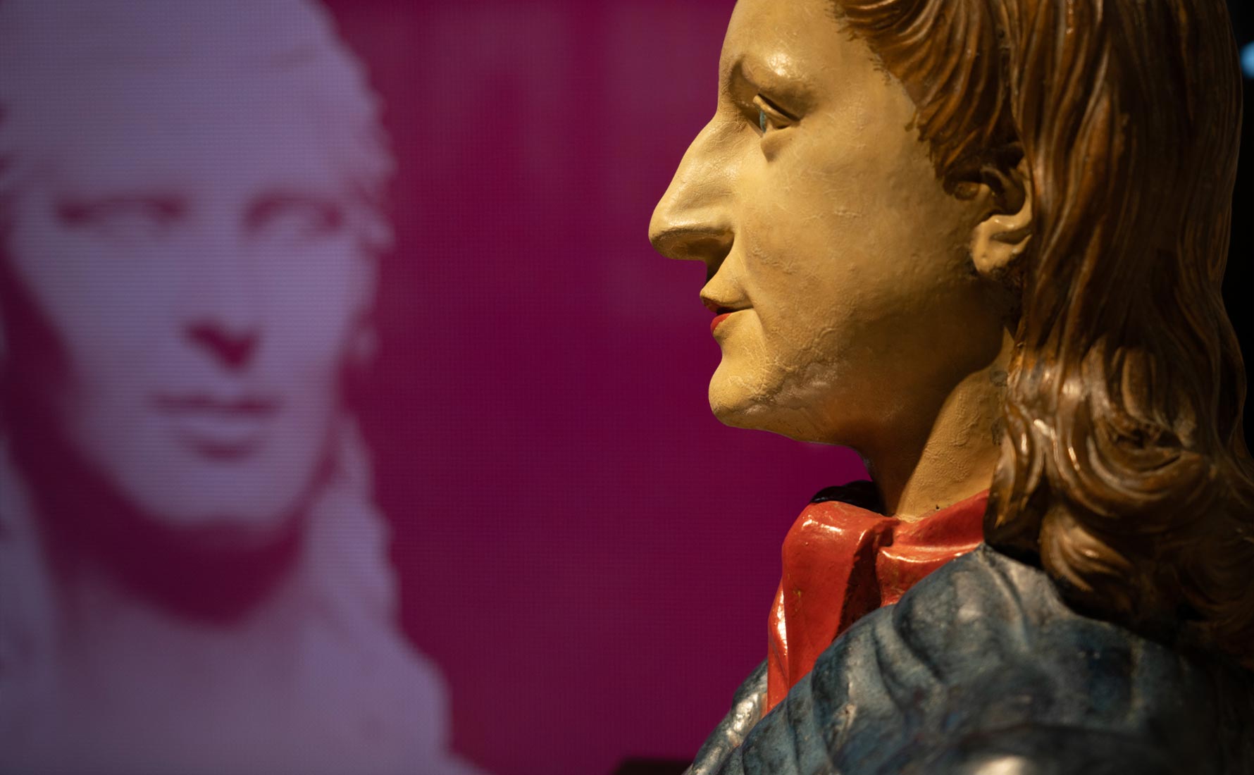
It is located inside the buildings of the former tanneries, which were one of the fulcrum of the work of Fabriano and now hosts the laboratory on paper, the museum Edgardo Mannucci-Quirino Ruggeri, some spaces for education, the dining areas and workshop as meeting and sharing places. The reopening of these spaces is an opportunity for all citizens to rediscover and admire a place that was forgotten.
IDENTITY
The sens matrix of the entire design was determined by the identity concept that was decomposed and placed on different assets to constitute the direction towards the final goal: the recomposition of the identity of the place. Starting from a historical survey, the working group collected interviews and testimonies and studied case studies coherent with the project.
The Fabriano tanneries existed in the Middle Ages.already in 1200 the Benedictine monks tanned the skins to make the parchment, on which then the amanuensi of the abbey wrote the codes and the notaries drew up the various acts of the monastery. One of the owners of Fabriano tanneries improved the techniques of paper production.It is to him that historians also attribute the merit of having introduced the filigree technique.
Social analysis was aimed at photographing the perception of the people who experience the place and live in the place. Using the interview methodology, in addition to bringing out the essential parameters used to elaborate an identity which best identifies the project, has allowed the working group to enter into a relationship with the community and establish a direct contact, made of suggestions, emotions and sensations.
Consider some case studies, analyzing the identity of multifunctional cultural hubs similar to the one we were working on and studying the marketing and communication strategies adopted, allowed to develop an integrated communication strategy, that in addition to having the important characteristic of being contemporary has been able to express the values and peculiarities that animate this important initiative of urban regeneration.
NAMING AND PAYOFF
The goal is to give an identity to the place and the spontaneous choice was to return to call it with a name that inhabits the everyday life of Fabriano: Zonaconce. A choice that highlights the strong connotation of a well-defined and recognizable ZONE, recovering in an innovative key and returning in a contemporary key all the identity features of the place. A talking name that enhances the characteristics and specific connotations of the Conce district.
The playoff “The forms of doing” ("Le forme del fare") combines the concepts of Form (linguistic, architectural, geometric, artistic, musical) and Do (gestures of crafts, processing of leather and paper, craftsmanship and active place).
BRAND AND LOGOTYPE
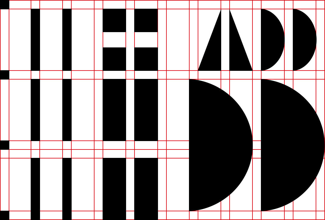
The identity proposed focuses on the main architectural element present in the facades of the building. The wooden masking, useful to ensure a correct and constant flow of air in the floors where once the skins were stored for drying, turns into a modular grid, fundamental to characterise coherently all the graphic signs belonging to the new identity of the cultural pole. The brand is the first element to be designed, maintaining the proportions of the modular cage.
We decided to work on the initial letters of Zonaconce, precisely to emphasize the double conformation on an architectural level. It is interesting to notice some small details related to the architectural conformation: the space between the "Z" and the "C" recalls the alley between the two buildings and the sharp and slightly edgy lines are a subtle reference to the design of the floor plan of the old tanneries.


BASIC SHAPES AND TEXTURES
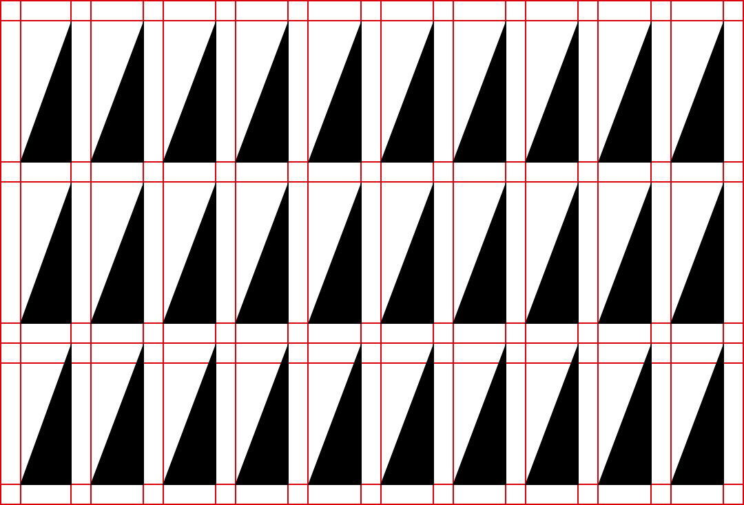
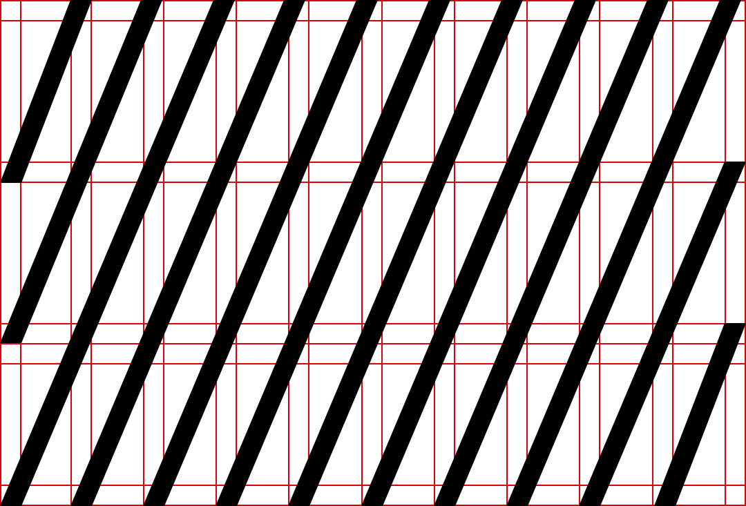
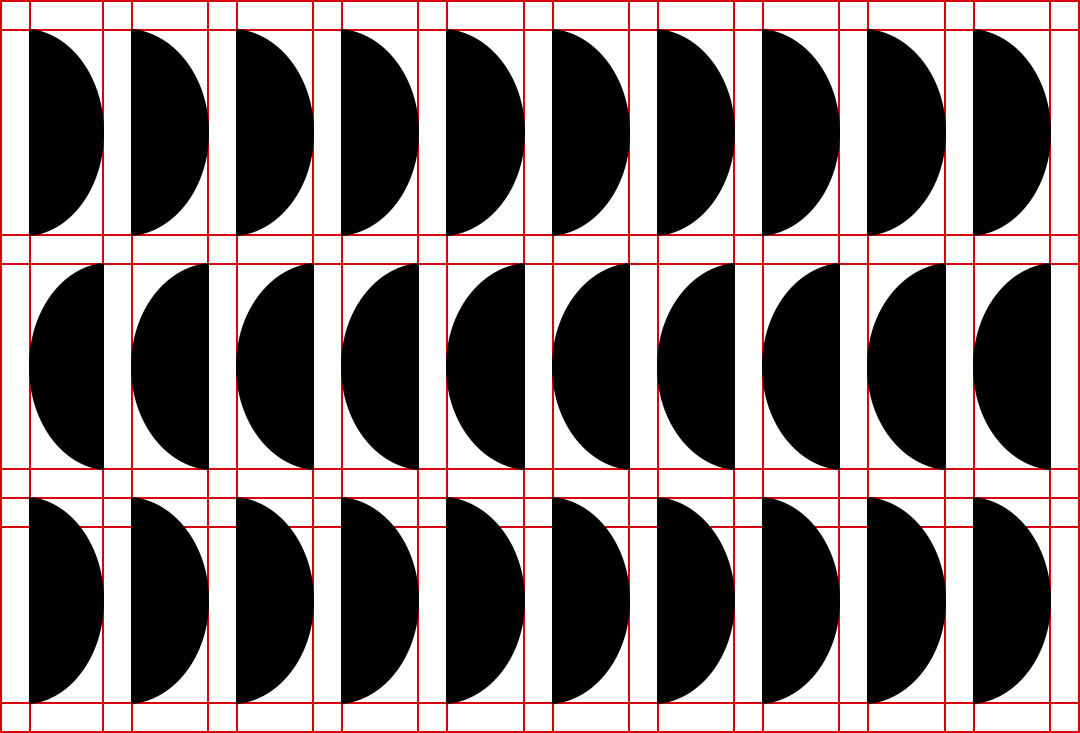
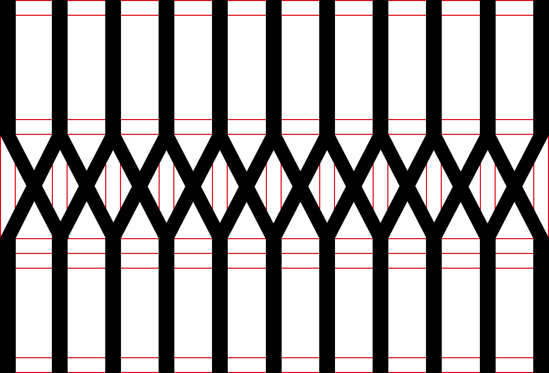
Inside the modular cage it was possible to build a set of "basic" shapes useful for the design of all the graphic elements necessary for the construction of the entire identity. This type of approach allows the creation of infinite combinations to generate pictograms, textures, signage and exhibition elements. All the elements generated by the combination of these forms will be perceived as belonging to a single communication system, because they all belong to the same design matrix.
Texture is the first graphical element composed using the set of "basic shapes" previously described. The texture production process also uses the grid, allowing visual continuity with respect to the previously created elements.
GENERATIVE BRAND
Since we are aware of the fact that in the collective imagination the word "Conce" has a greater impact on the perception of the place by the community, and that the word "forms" (in the payoff) must also be perceived from a visual point of view, we chose to highlight more the letter "C" making the most out of the modular cage’s compositional capabilities.
The output is a dynamic brand capable of narrating a place that must be dynamic and flexible to be able to welcome all the various forms of contemporary culture.
MODULAR TYPOGRAPHY
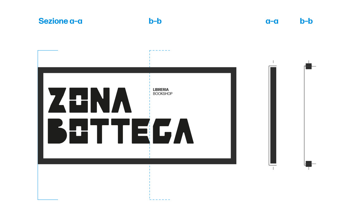
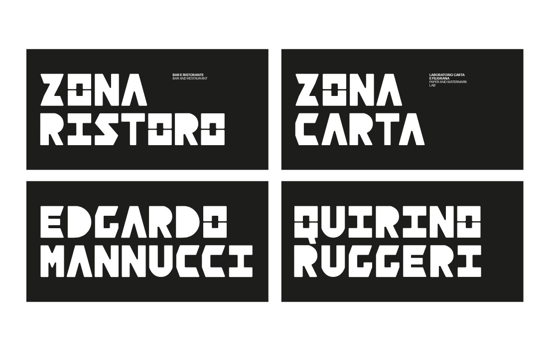
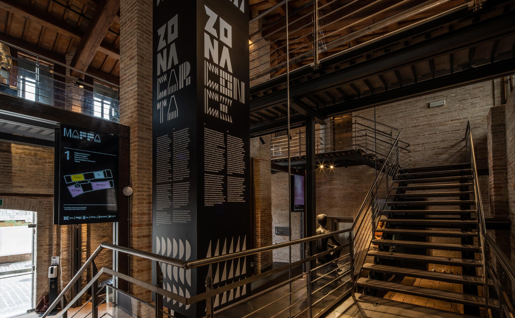
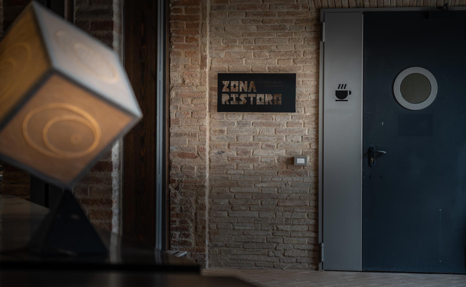
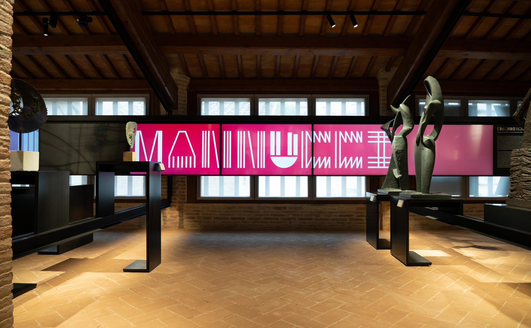
For the primary typography it has been chosen to design a custom font for titration. The production process resumes the” basic forms” and articulates them on the modular grid in order to produce every alphabet letter.
MULTIMEDIA AND SIGNAGE
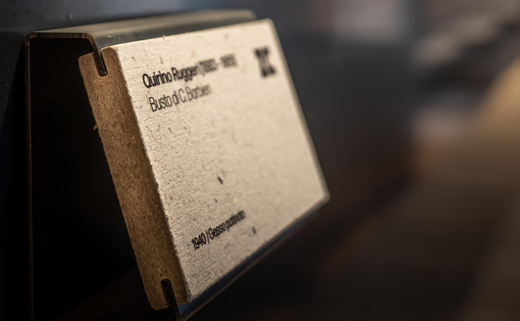
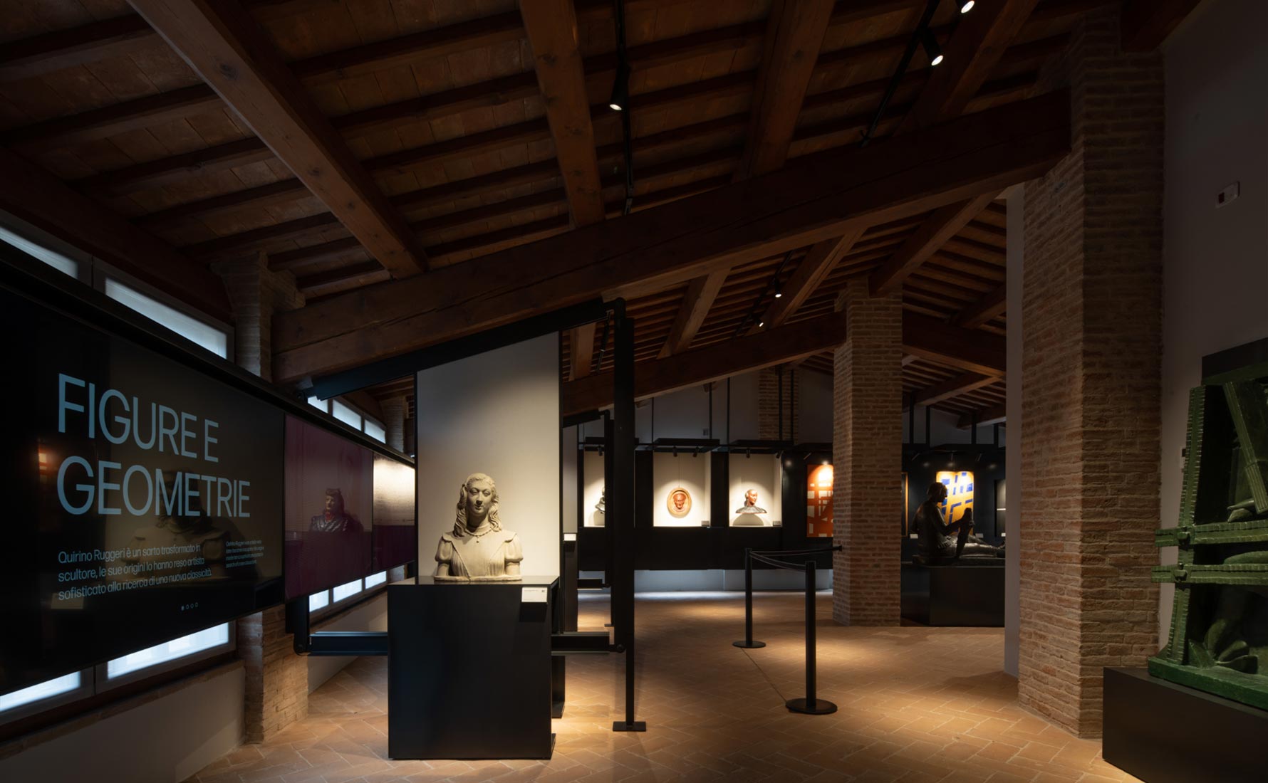
EQUIPMENT FOR THE MUSEUM
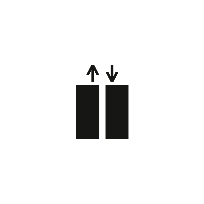
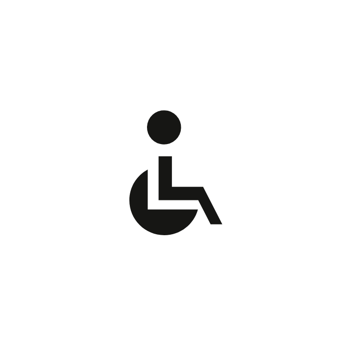
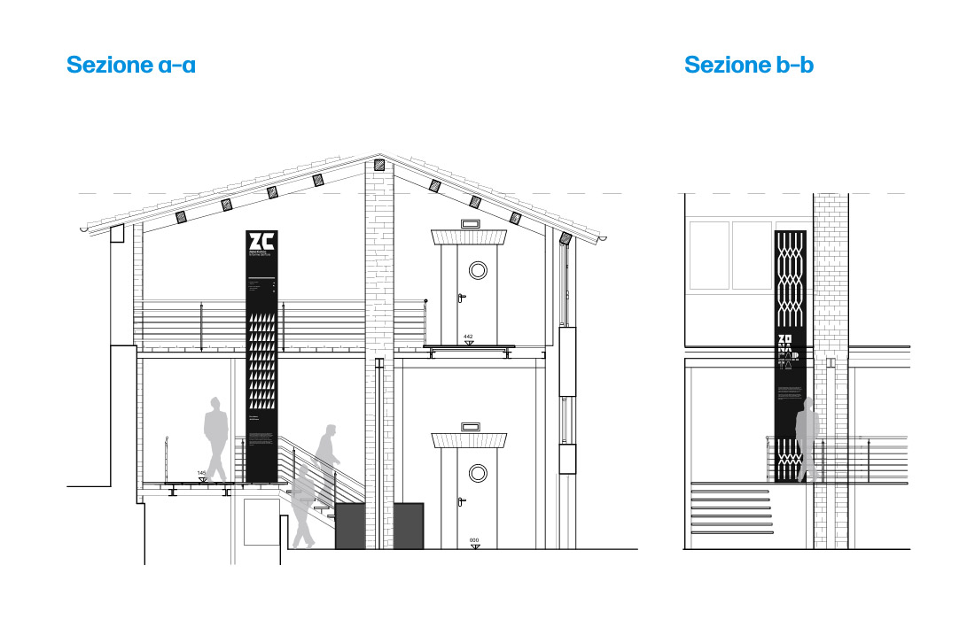
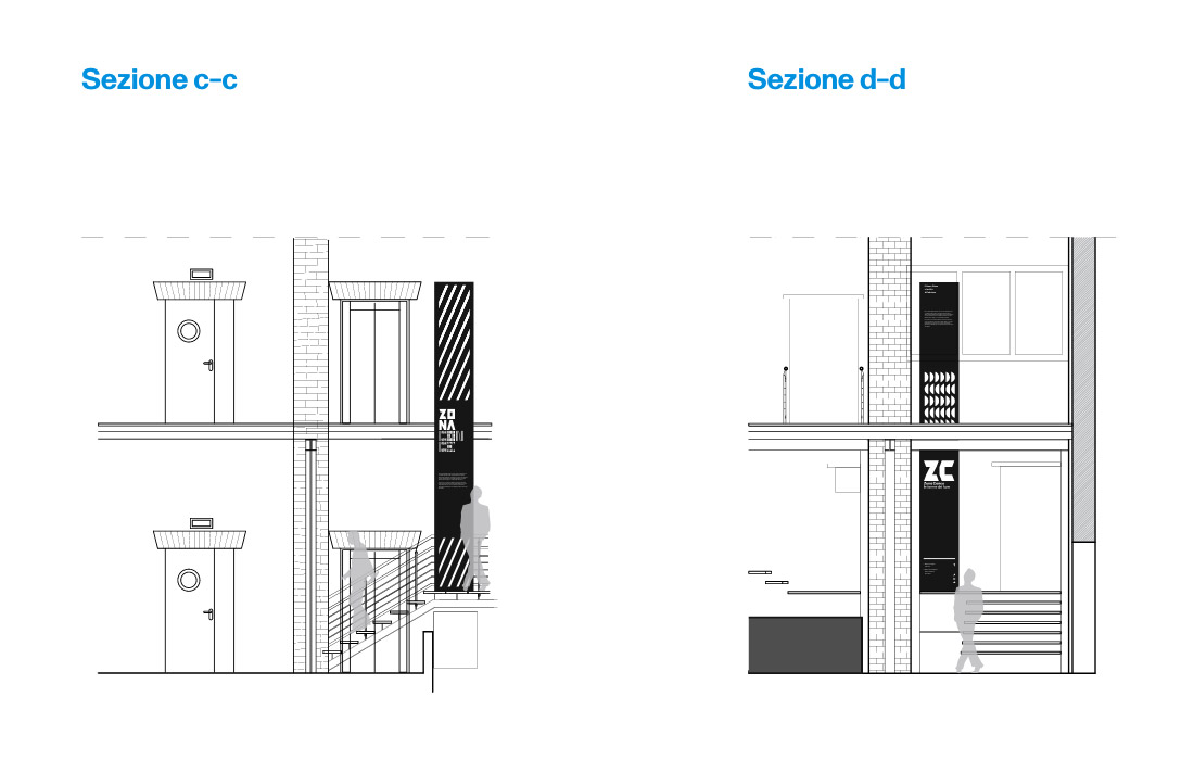
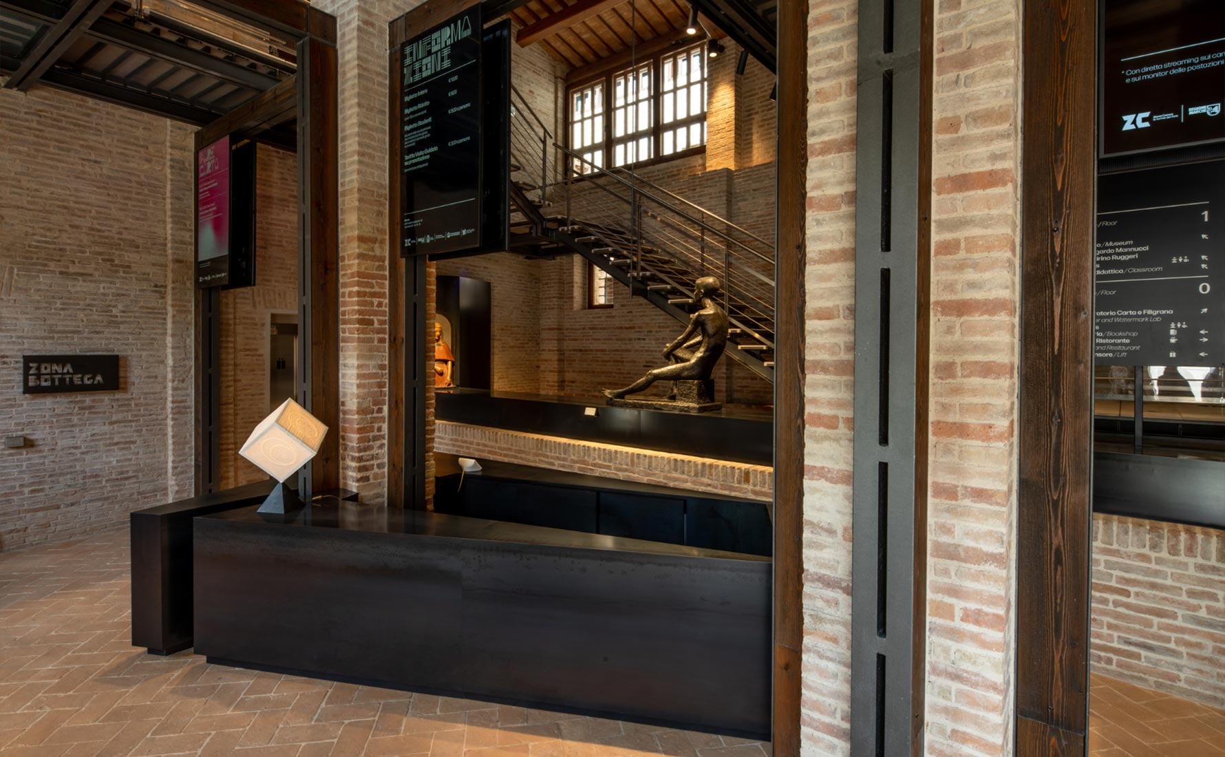
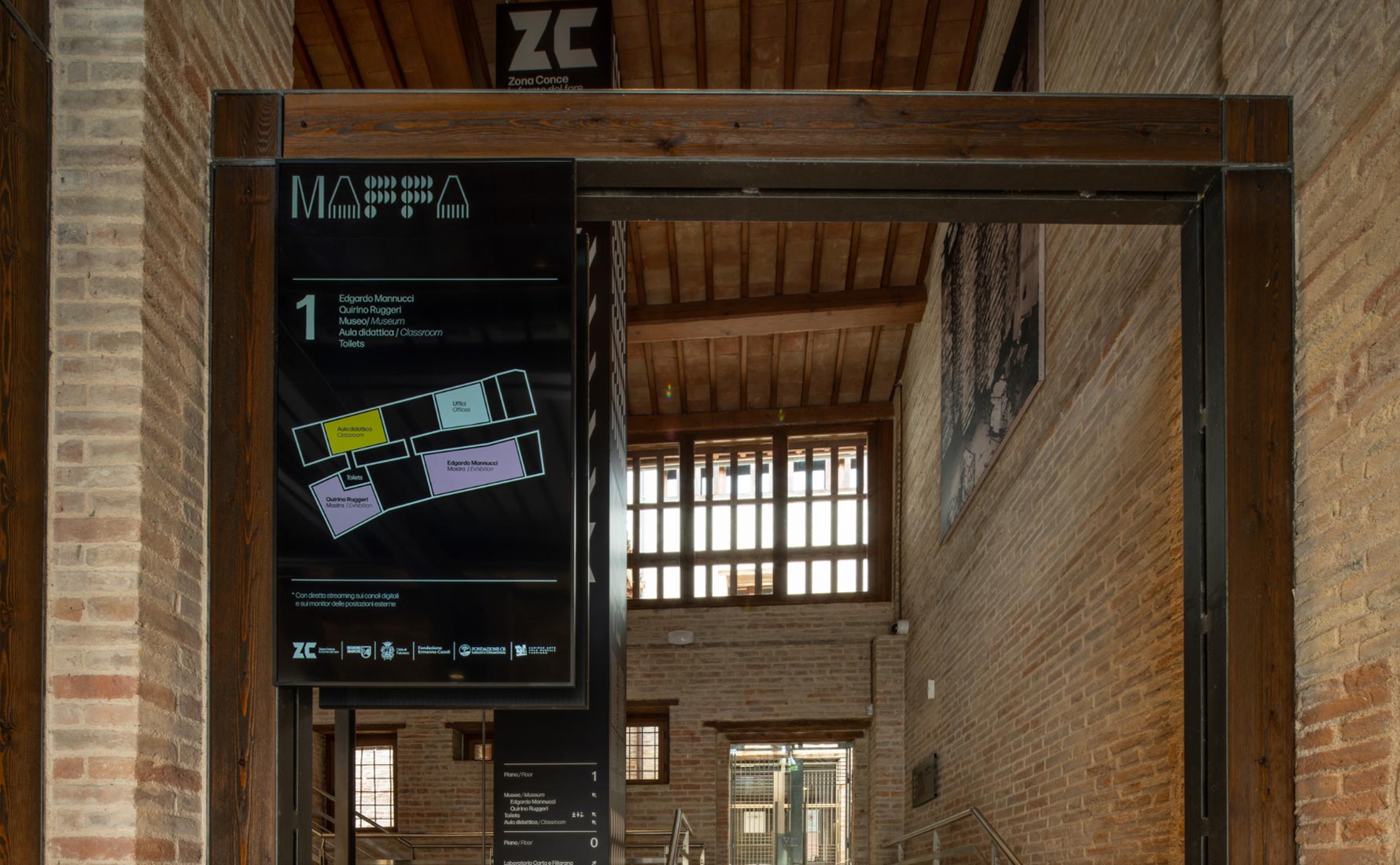
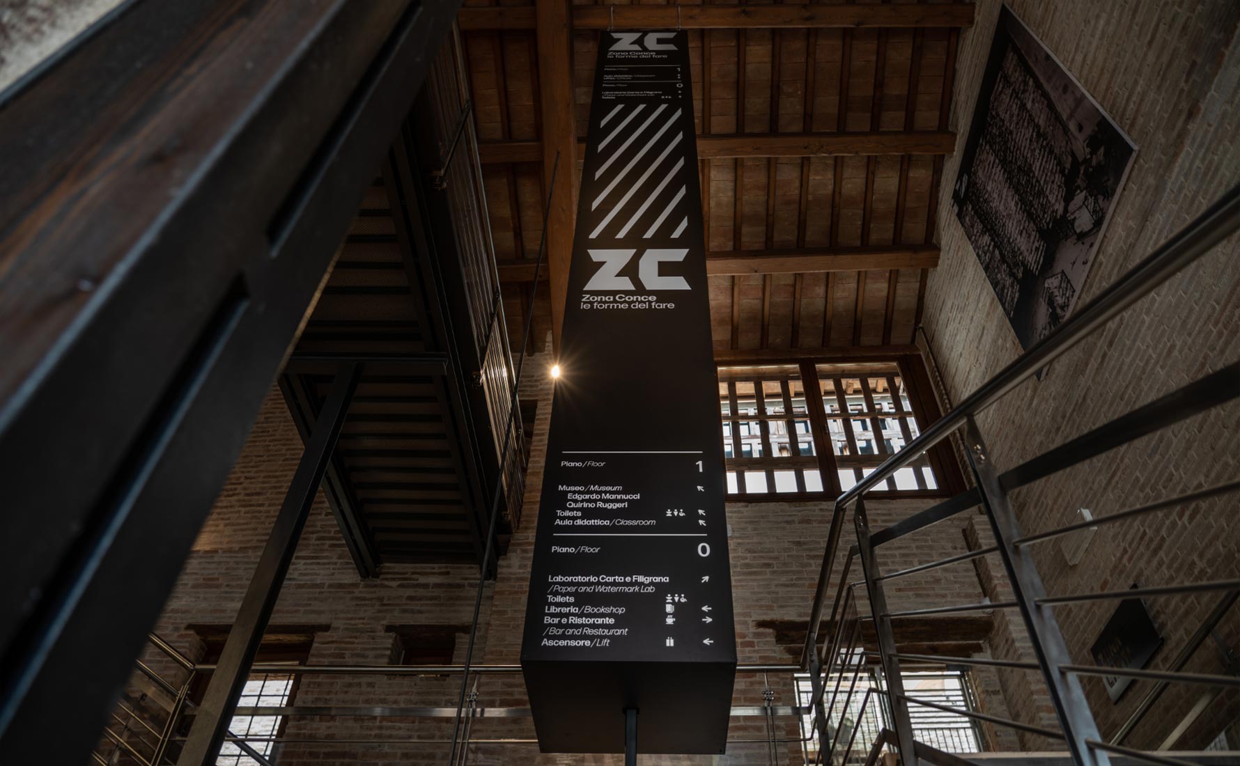
The identitary system has been tested to be carried through online and offline communication tools, especially thanks to the generative component created to be highly readable in every kind of communication tools and that allows functional applications on a multimedial and signage level.




RELATED PROJECTS

