TONIDIGRIGIO PROFESSIONALS IN COMMUNICATION
PROJECTS →
ZAM
BRAND IDENTITY
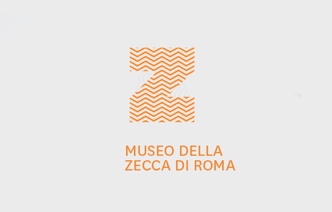
ISTITUTO POLIGRAFICO
E ZECCA DELLO STATO
ROMA,
2019
SELECTED AND PUBBLISHED ON:
AWDA AIAP WOMEN DESIGN AWARDS 2019
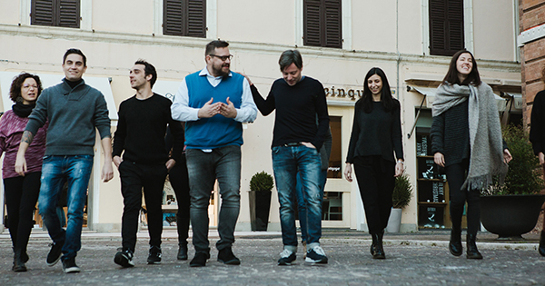
In collaboration with:
Atelier(s) Alfonso Femia AF517,
Mauro and Chiara Mortaroli,
Videoworks group
The decision of presenting two different generative identities of the building is based on a consideration on its dual initial use, the production of coins and banknotes. Both identities are developed in an integrated way to be applied on multiple levels and communicative contexts.
The two proposals, designed to be deeply connected to the sense of place, were developed through the same methodological process. We report both cases because we believe they are equally correct and interesting in their ability to express two different languages although born from the same design matrix.
CONCEPT - PROPOSAL 1
SELECTED PROPOSAL
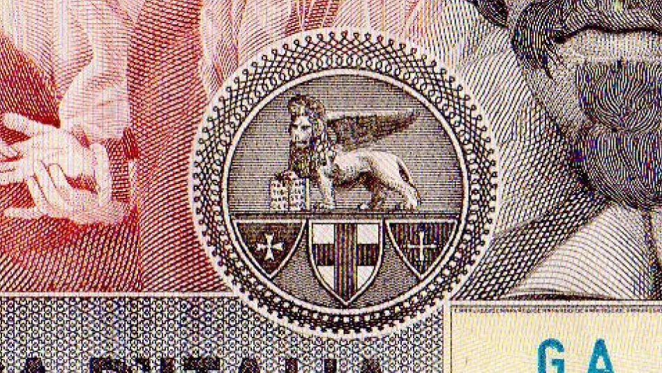
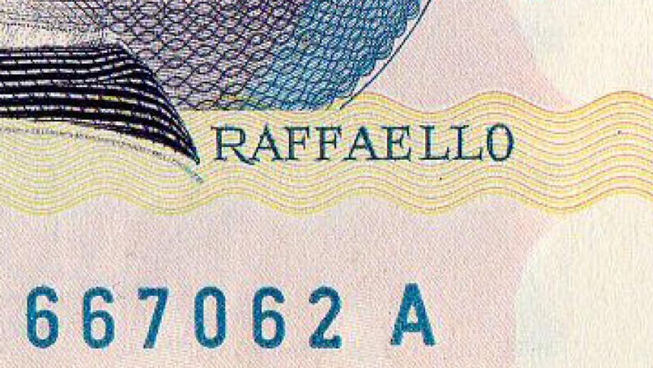
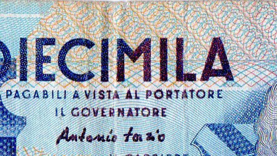
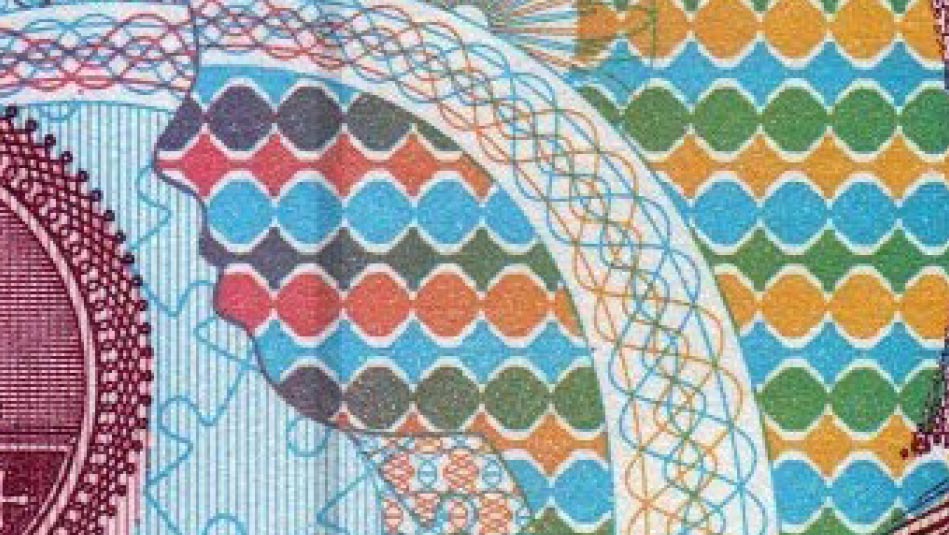
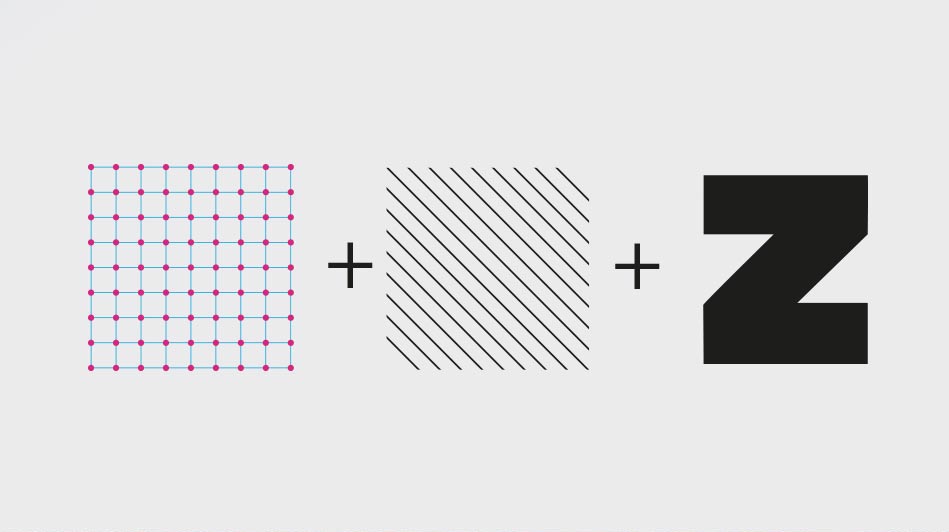
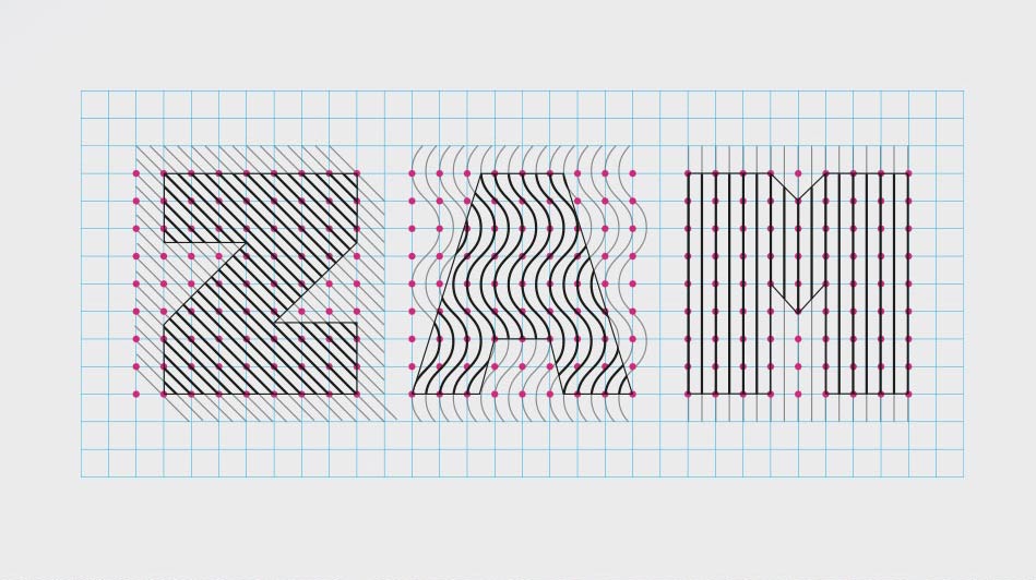
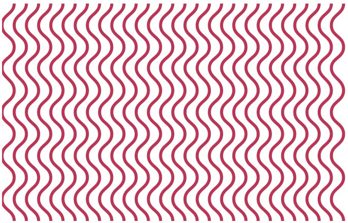
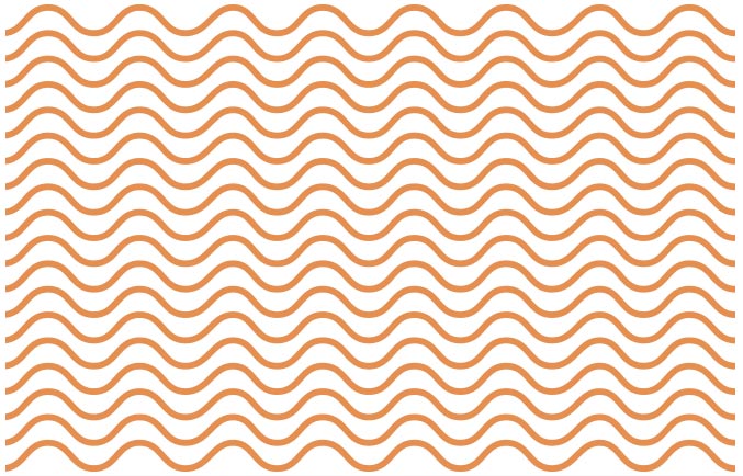
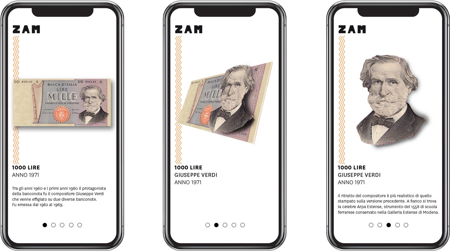
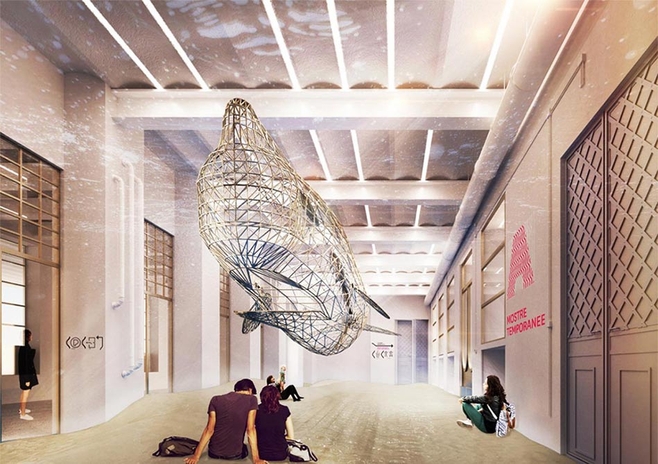
The initial research started from the analysis of the symbolism in the Lira’s banknote language. The concept of filigree, intended as the processing of thin woven metal filaments, has been studied in depth. The in-depth observation of the banknotes has led to identify and extrapolate the various textures, which characterize and differentiate the banknotes. Then the textures were inserted in a modular grid to match each other. The same cage was used in the creation of the typography of the logotype.
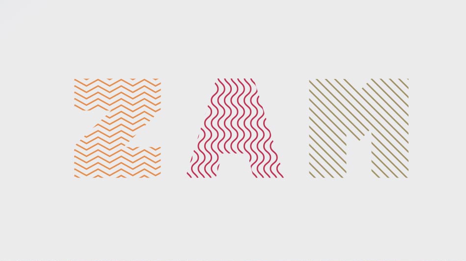
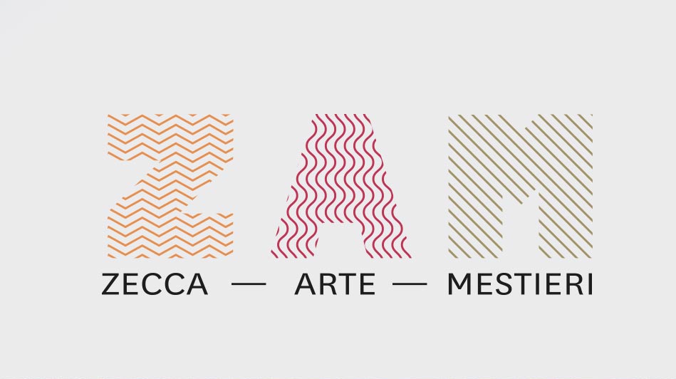
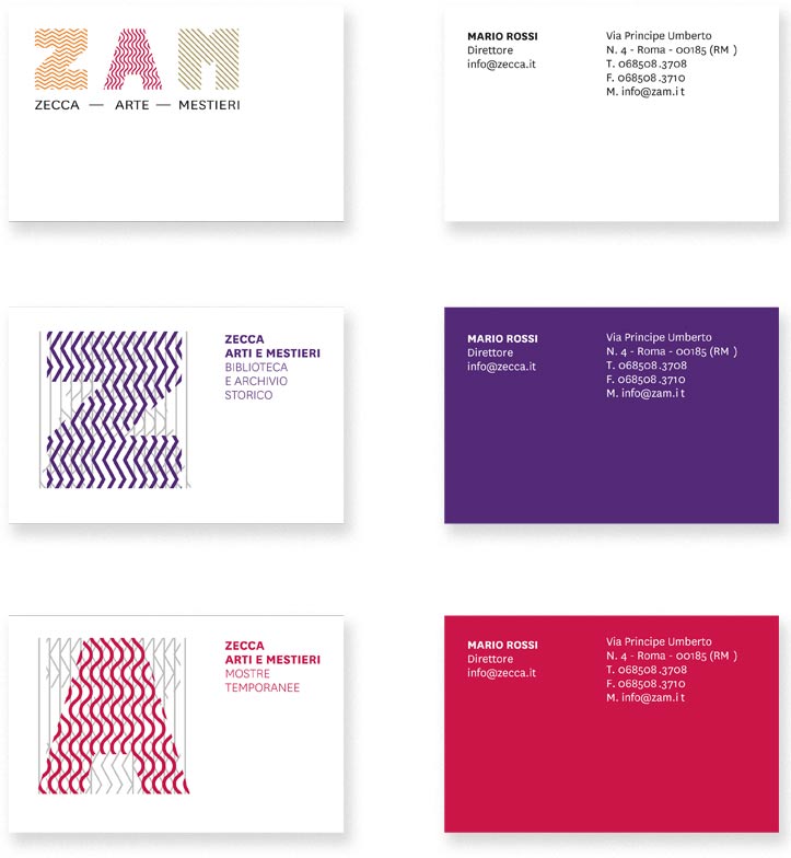
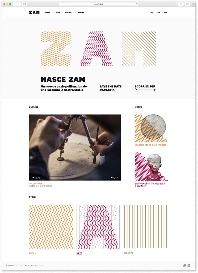
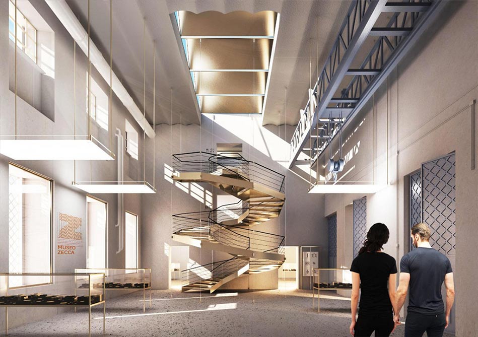
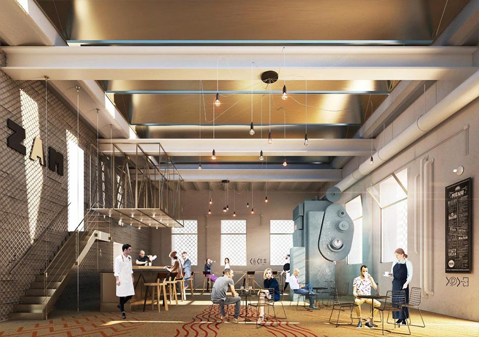
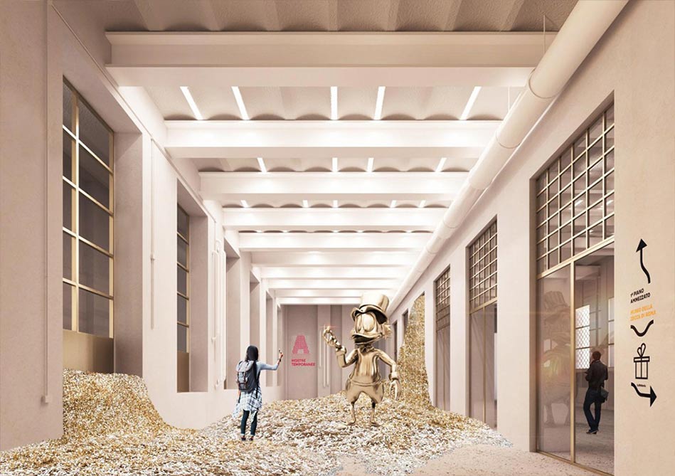
ZAM - ZECCA ARTE E MESTIERI
THE BRAND
Using the acronym system, often used in art and museums, ZAM Zecca, Arte e Mestieri was created. This naming proposal starts from the building role at the time of its foundation. However, the Mint is flanked by a new imaginary which is the multipurpose container open to both arts and crafts as a cultural heritage essential for the revaluation of this place. The institutional mark is composed by the typographical element which becomes a container of texture that differs in direction, type of line and color. The brand is formed by the acronym and the payoff which is the explanation of it and indicates the three realities that coexist together inside the building.
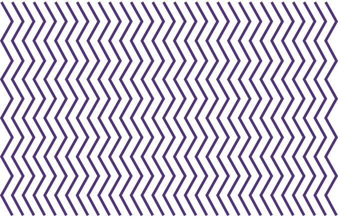
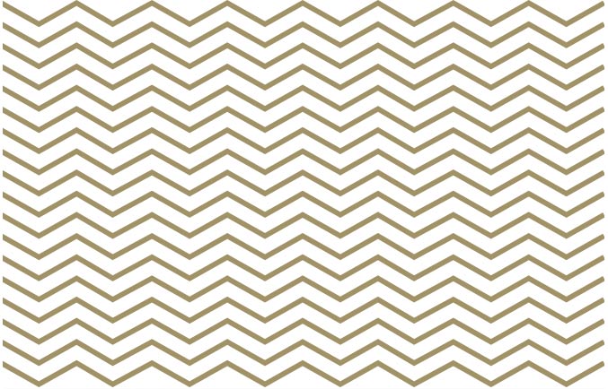

TEXTURE AND COLORS
The following colours and textures were sampled based on the elements inside the Lira banknotes. Later, they were reinterpreted and enlivened in order to contrast with the classical architecture of the palace.
Starting from the meaning of the payoff, the various interiors have been divided into three sets according to their meaning and function. Each group is represented by the overlapping of the letters of ZAM, where only the letter that represents that group dealing with service activities is turned on.
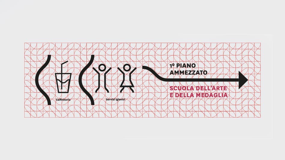
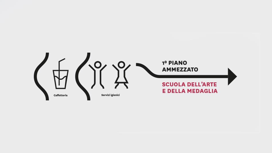
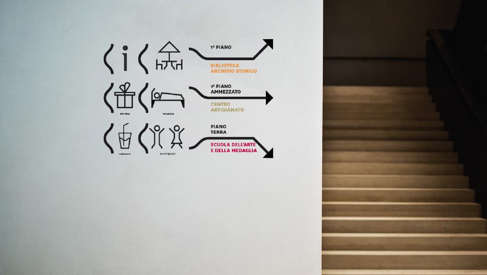
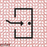
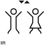
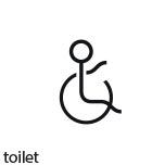
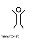
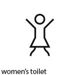
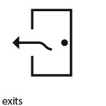
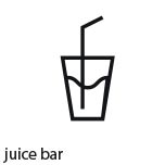
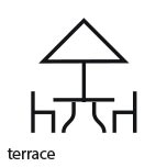
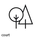
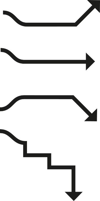
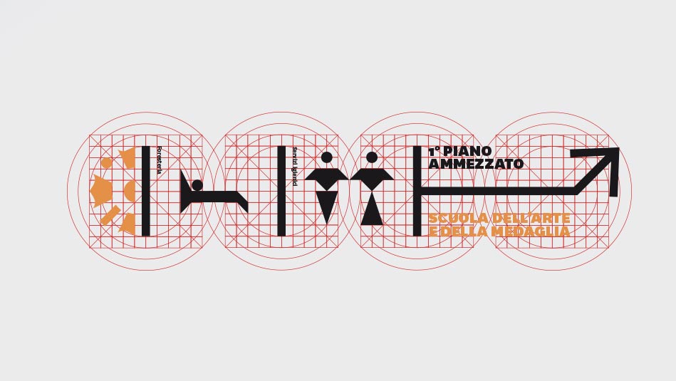
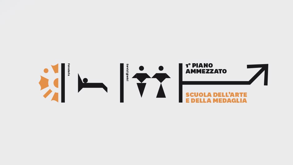
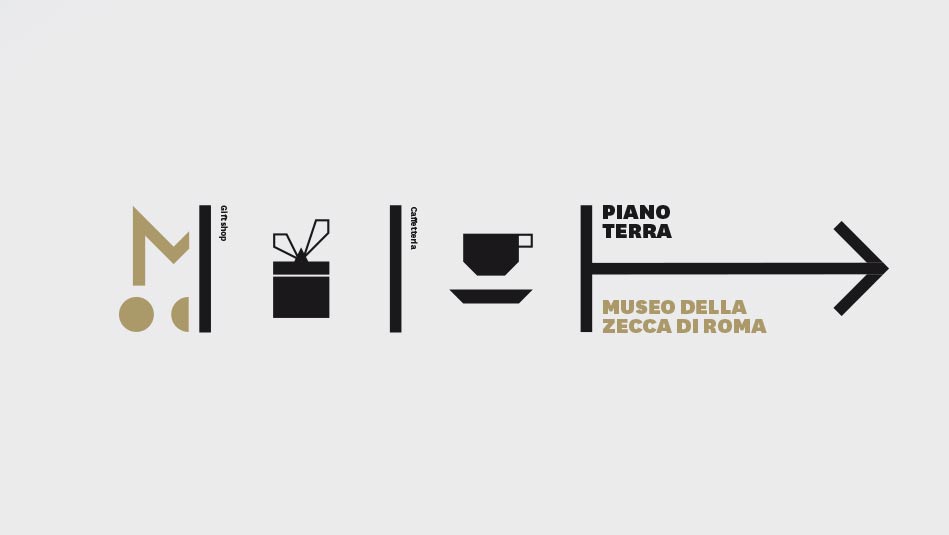
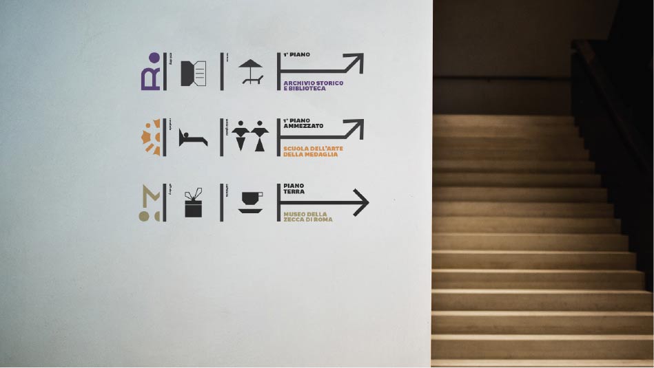
SIGNAGE
The signage elements were designed on a cage formed by the overlapping of the base grid with the wavy texture.


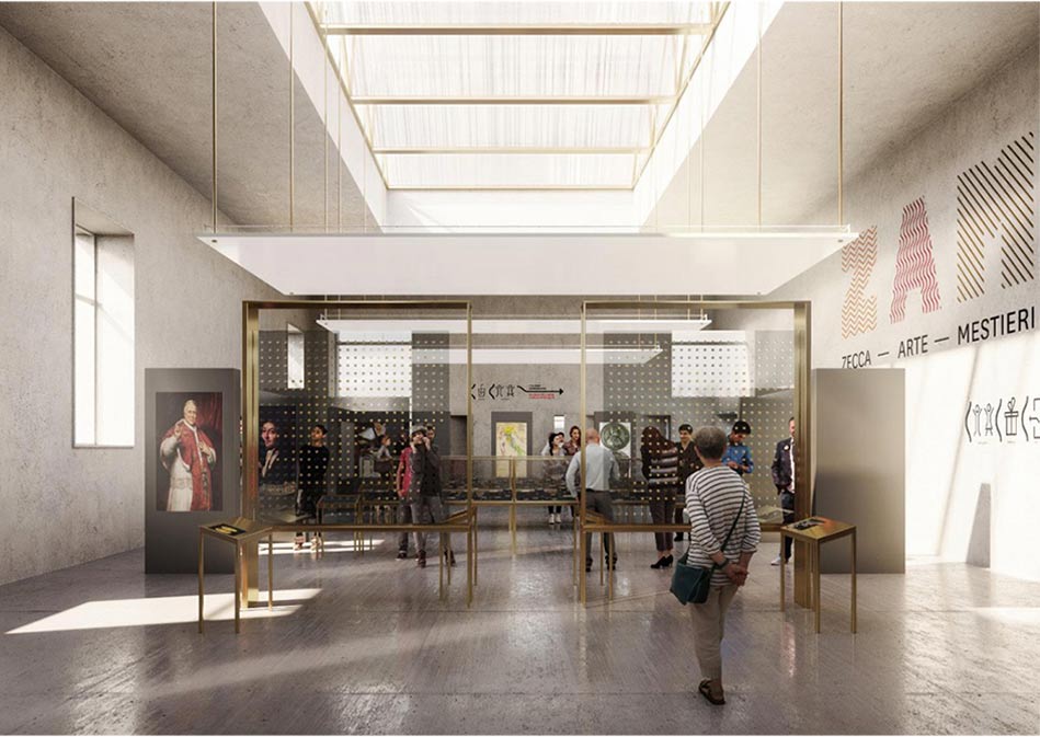

THE SET-UP
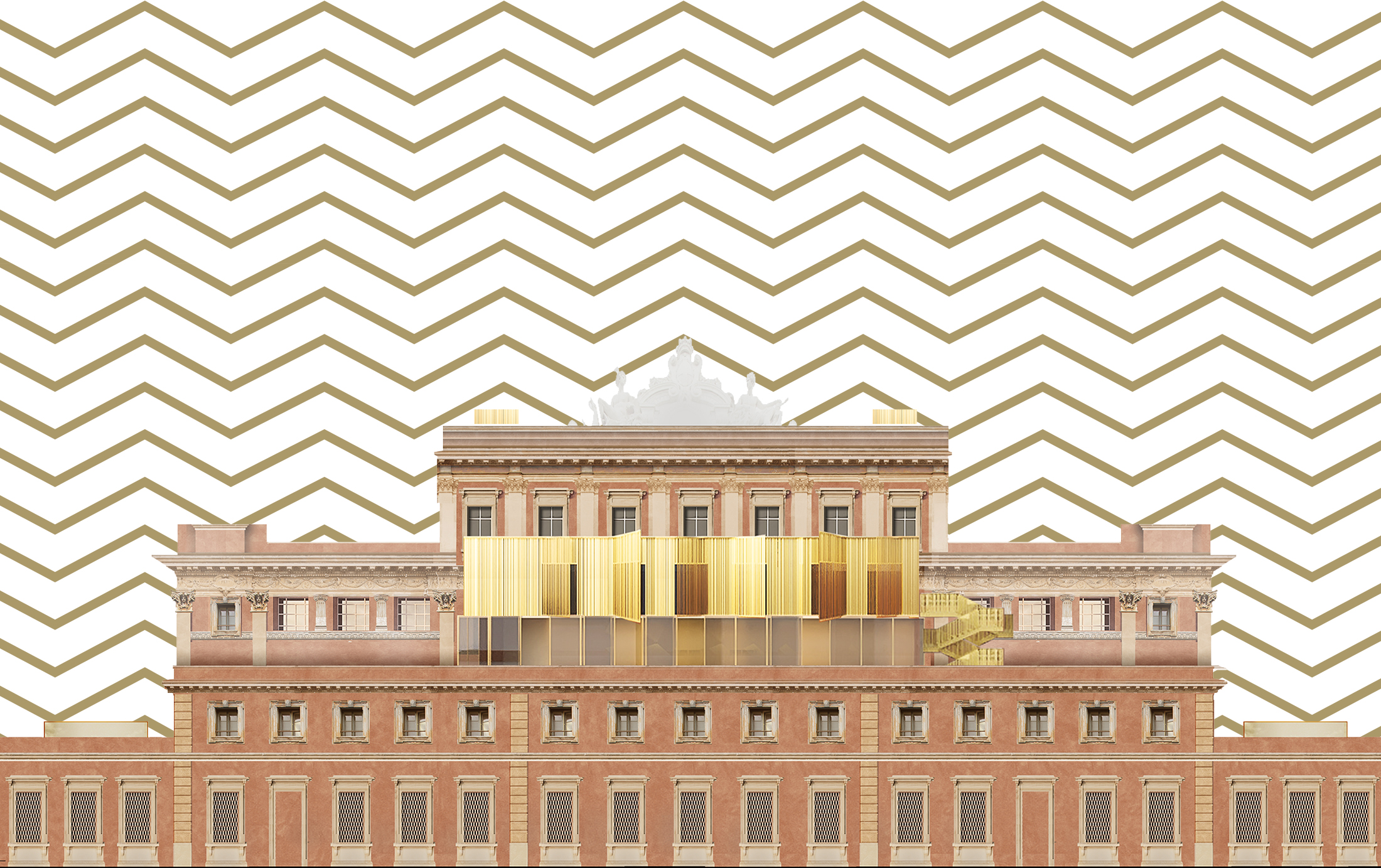
The redevelopment project provides for the development of a unique cultural centre with a museum vocation, to better preserve the artistic resources of the national numismatic heritage and the industrial archaeology section. But at the same time it will be a place of training and promotion for the "art crafts", more welcoming for the precious tradition of the School of the Medal Art, active in the building since the inauguration, in 1911. The redevelopment and recovery of the historic building that hosted the first "Mint of Italy" becomes a reality thanks to the enhancement project presented by the group led by Studio Atelier(s) Alfonso Femia.
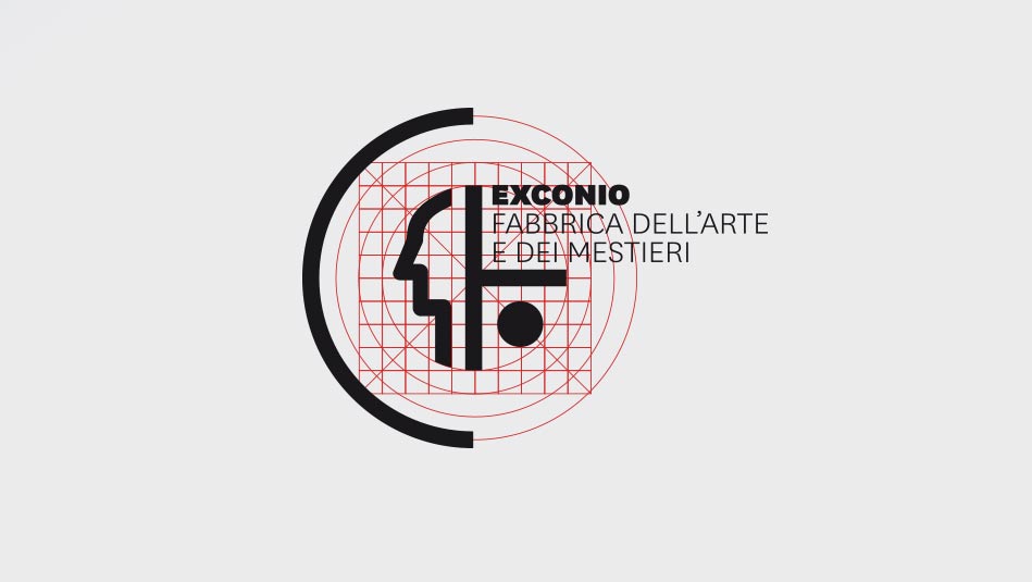
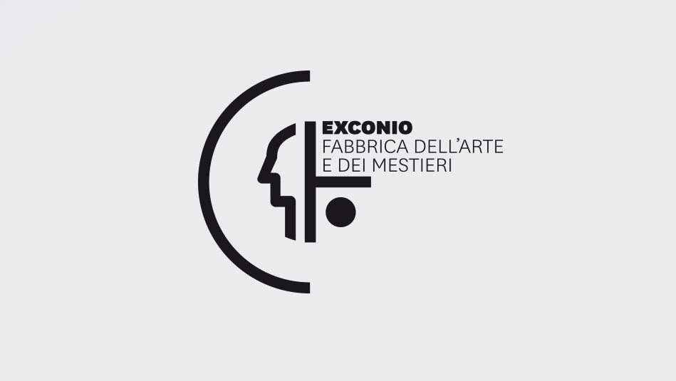
CONCEPT - PROPOSAL 2
REJECTED PROPOSAL
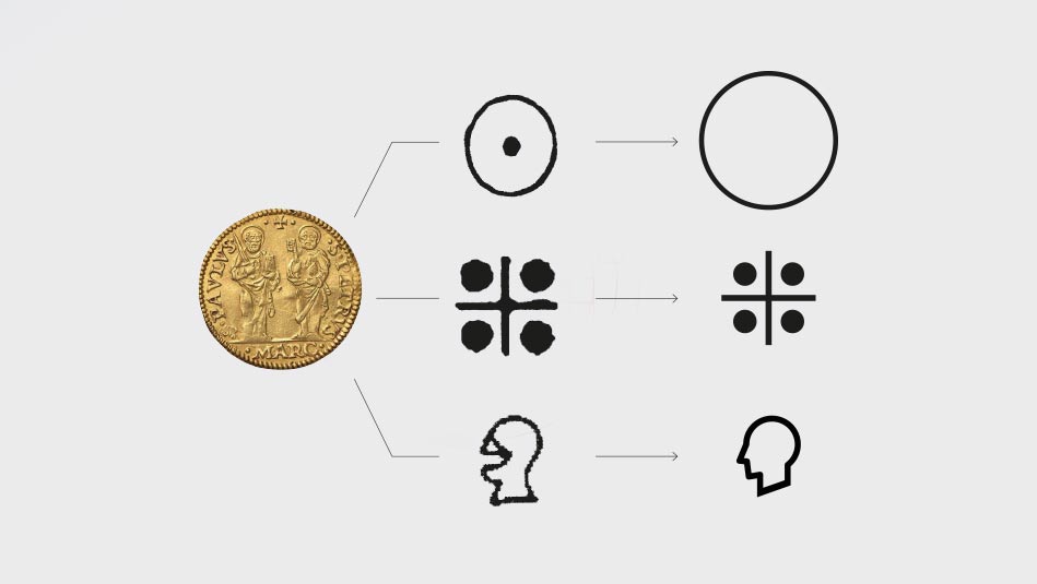
The research began with the analysis of the symbology belonging to the language of coins and medals, with the aim of determining a common denominator useful to start a process of proposition. The study of coins has led to the identification of abstract and other more realistic elements. The process of defining the seal consists of the union of an abstract and a realistic element, enclosed within a circumference representing the coin/medal. Each component has been built on a modular cage in order to standardize all the symbols.
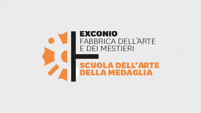
EX MINTING THE MARK
The naming recalls the concept of "old coin", inserting itself in the imaginary of a place that changes shape and function, while maintaining its memory. In the naming structure there is the combination of two important semantic areas, translated into two very precise terms: the word CONIO, to recall the object of coin and the action of minting coins, and the word EX used to indicate a condition prior to the current one. The name is accompanied by the payoff "Factory of art and crafts", which in turn recalls the past and the present, opening itself to numerous other possibilities.
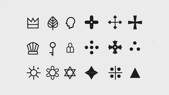
SYMBOLIC ALPHABET
On the base of the grid were drawn all the elements that contribute to the creation of a new symbolic alphabet. The realistic elements of the alphabet are drawn in outline, while the abstract elements are represented by full forms.
Each environment has its own identity, defined according to the process described above, which uses symbolic elements extrapolated from the iconography of coins and re-elected according to the meaning and function of the environment.
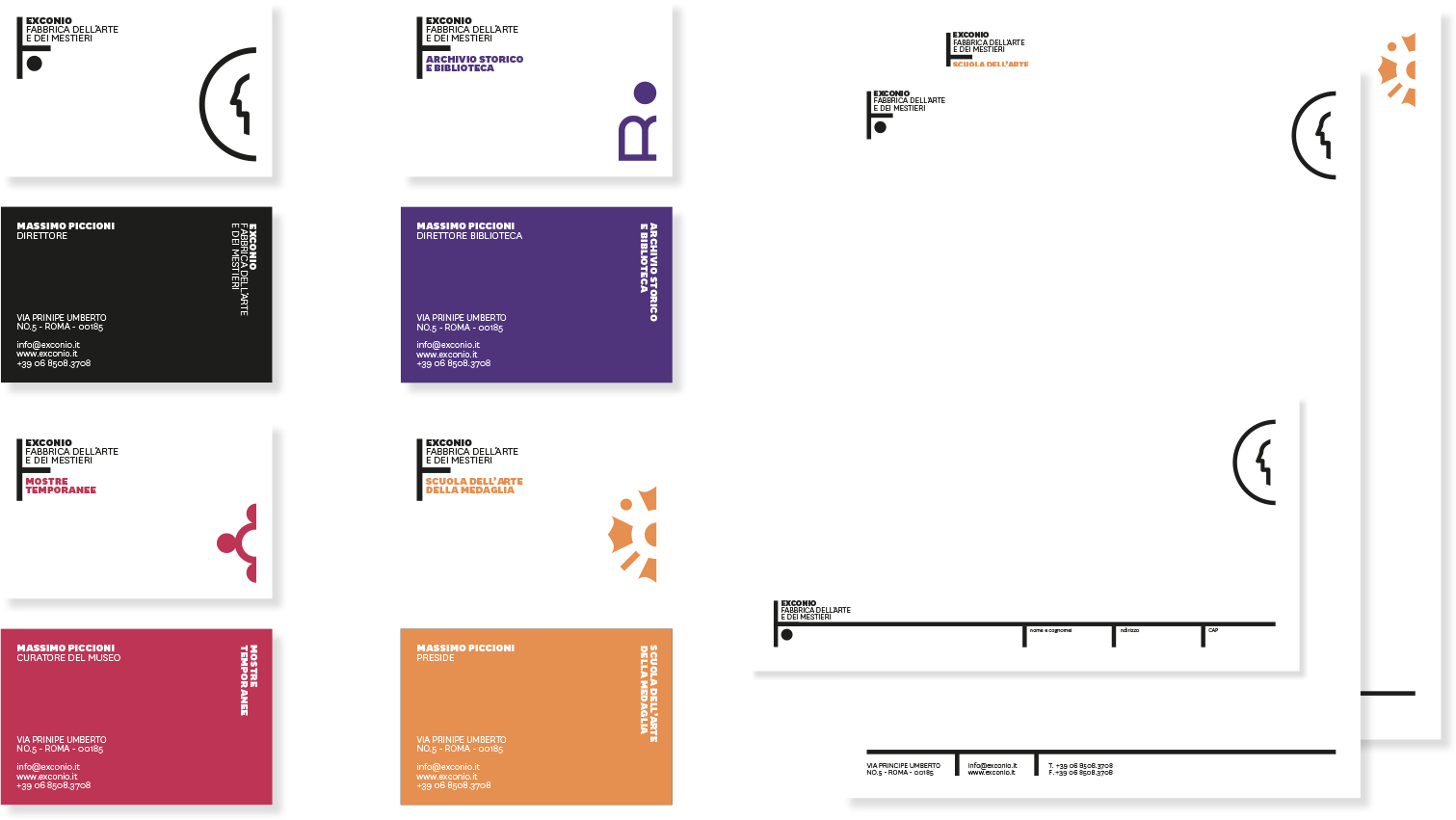
SIGNAGE
The icons of external and internal signage were also designed based on the same grid on which the brand was developed.


RELATED PROJECTS


CNR – NATIONAL RESEARCH COUNCIL
2020 - CNR - Research Institutes in the Marine Environment
Related Articles